Different patient needs arrive with different levels of urgency.
A family practice has to support checkups, children, repair, replacement, cosmetic goals, and same-day concerns without making the homepage feel fragmented.
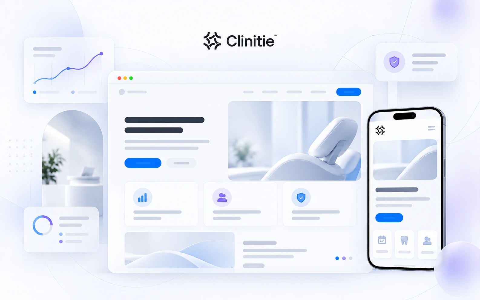
A dental website direction built around everyday family care, urgent needs, comfort, affordability, and a first-visit sequence that reduces uncertainty on both desktop and mobile.
The purpose is to show strategy, structure, design thinking, responsive behavior, and the level of care a dental website direction can receive.
The direction helps families, nervous patients, and people in pain start with the reason they arrived—not with dental terminology they may not know.
A family practice has to support checkups, children, repair, replacement, cosmetic goals, and same-day concerns without making the homepage feel fragmented.
Patients need fast orientation, practical reassurance, a clear sense of the team, and a visible route to request care.
The concept places comfort and relationship cues beside service pathways, financial guidance, local context, first-visit steps, and a direct request flow.
Explore the actual sample site inside the case study. Switch the live viewport between desktop and mobile without leaving the portfolio page.
Good dental website design is not about decorating every surface. It is about putting the right reassurance, clarity, and action in the right order.
The opening view creates confidence with restraint, readable hierarchy, and enough breathing room for the clinic to feel premium without feeling distant.
Service choices are structured to reduce scanning effort and help visitors move from “what do you do?” to “this looks relevant to me.”
Proof, team context, review cues, and reassurance belong close to the moments where a patient decides whether to continue.
Booking is treated as part of the information architecture—not a floating demand disconnected from the patient’s decision process.
This direction is presented as a connected Clinitie workflow rather than as a single isolated design task.
This slot is intentionally designed for a YouTube or Vimeo walkthrough when one exists. The page still works without a video, so the template never depends on fabricated media.
YouTube / Vimeo readyUse this area for a real walkthrough, design rationale, or guided prototype recording when the project has one.
These are the reusable explanation blocks that let a future client see why the direction looks the way it does.
The opening screen needs to feel considered and trustworthy before it needs to feel impressive. Strong type, calm space, and one obvious next step do more than a crowded collage.
Trust cues are strongest when they answer uncertainty at the moment it appears—not when they are isolated in a generic testimonial block far below the decision.
Mobile has less space and more urgency. The visual hierarchy is re-prioritized so services, confidence, contact, and booking remain easy to scan with one hand.
The appointment action is consistently visible, but it does not overpower the information a patient needs before feeling ready to use it.
These are the design and strategy qualities this concept is built to demonstrate.